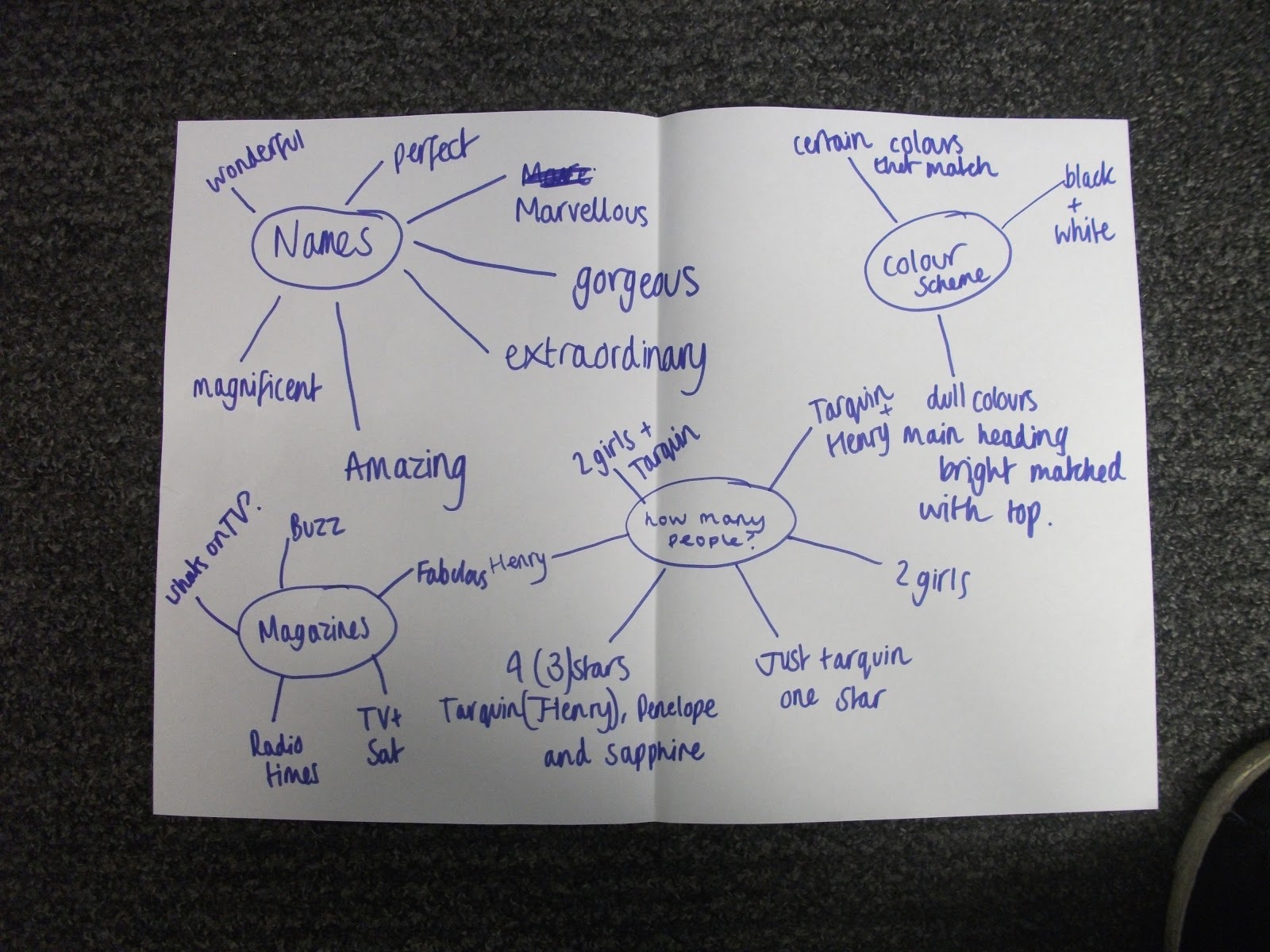
This was our second piece of ancillary planning, we thought about names and different types of magazines, due to what type of magazine it was, this would change colour schemes and the amount of people on the front cover. We thought of various different combinations which would affect whether the magazine was 'classy' or 'trashy'.

We took these photos and used them as inspiration towards our main ancillarie's photo. For example wearing a suit instead of typical clothes, this will affect the audiences view of the character. We again want to further this by colour matching the title with a tie or shirt - this will keep a classy look to the magazine but still have features that stand out.

Here we decided to plan out what the front cover could/would look like, this gave us a more realistic look into what photos and edits we were looking for. By doing so it made it a lot easier to design and follow through. We all made an input as to what we personally wanted and combined the ideas, for example the black and white back ground with one bright colour. We all liked the idea of the colour sticking out however others wanted to keep the background colour. We didn't want to think of features together because we all wanted something different but we made sure everyone was along the same lines.

This was the original piece of planning, as you can see there isn't much detail, it was just a basic brief bit of research more about the magazines than what we were doing. We were looking at what the magazine was trying to achieve, and how it would achieve it's aim.

We wanted to ensure we made the storyline clear from the ancillaries, both front cover and poster needed to resemble a brief storyline which passing trade would understand at a glimpse.
No comments:
Post a Comment